In the digital landscape, a well-placed Call to Action (CTA) can significantly enhance user engagement and conversion rates. For small businesses looking to optimize their websites, understanding the nuances of effective CTA placement is crucial. This article explores the best CTA placement strategies, design considerations, and the impact of color choices.
Why CTA Placement Matters
A CTA serves as a prompt that encourages website visitors to take a specific action, such as subscribing to a newsletter, making a purchase, or contacting a business. Where a CTA is placed on a webpage can greatly affect how many users interact with it. Poor placement may result in missed opportunities, while strategic positioning can guide visitors through the conversion funnel.
Best CTA Placement Strategies
Effective CTA placement ensures that users notice and engage with the action you want them to take. Below are the most effective locations for CTAs on a small business website.
1. Above the Fold
The area visible when a page first loads—known as “above the fold”—is one of the most impactful places for a CTA. Since users don’t need to scroll to see it, this placement works well for primary actions like scheduling a consultation or making a purchase.
2. Within Content Flow
CTAs embedded within blog posts, service descriptions, or product pages feel natural and can lead to higher conversions. When users are already engaged with the content, they are more likely to take action if prompted at the right moment.
3. End of Content
After providing valuable information, a CTA at the end of a blog post or product description encourages users to take the next step. Since they have just absorbed useful details, they may be more inclined to act.
4. Sidebar Placement
CTAs in the sidebar remain visible as users scroll through a page. This location works well for secondary actions, such as downloading a resource or signing up for an email list.
5. Exit-Intent Popups
When a user is about to leave the site, an exit-intent popup can be an effective way to re-engage them. These popups can offer discounts, free resources, or subscription incentives.

CTA Design: Making Your Button Stand Out
Beyond placement, the design of a CTA button plays a crucial role in its effectiveness. A CTA should be visually appealing and easy to spot.
- Size: Ensure the button is large enough to be noticed but not so big that it overwhelms the design.
- Contrast: The CTA should stand out against the background. A strong contrast helps draw attention.
- Wording: Use action-driven language, such as “Get Started,” “Claim Your Free Trial,” or “Book a Consultation.”
- Whitespace: Leave ample space around the CTA to make it easier to locate and click.
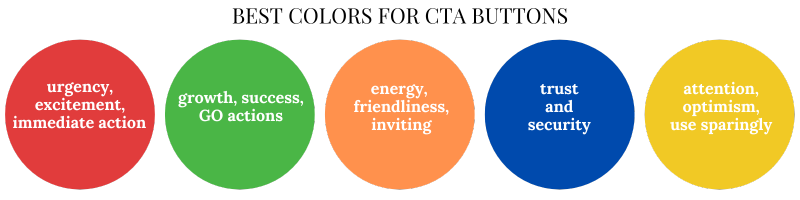
Best Colors for CTA Buttons
Color choice can influence user behavior and perception. Here are the best colors for CTA buttons:
- Red – Creates a sense of urgency and excitement, prompting immediate action.
- Green – Associated with growth and success, often used for “Go” actions.
- Orange – A combination of red’s energy and yellow’s friendliness, making it inviting.
- Blue – Evokes trust and security, suitable for actions that require user input.
- Yellow – Captures attention and conveys optimism but should be used sparingly to avoid overwhelming users.
To ensure visibility and accessibility, the chosen color should contrast well with the background. Conducting A/B tests can help determine which colors resonate most with your audience.
Conclusion
For small businesses, understanding the best CTA placement strategies can significantly impact website conversions. By positioning CTAs strategically, using eye-catching designs, and choosing effective colors, businesses can increase engagement and drive more actions from their visitors. A well-placed CTA acts as a guiding force, leading users seamlessly toward their next step.
For further insights on optimizing small business websites, check out our articles for best practices here.